

Book Excerpts: OOo Draw Documents with Imagination 102
As many of you know one of our own, Robin 'Roblimo' Miller, recently had his book "Point & Click OpenOffice.org" published. Below is an excerpt from the book. In addition to this teaser chapter you can also find related videos over at Newsforge and if your are so inclined you can also snag a copy direct from Robin.
Chapter 4
OOo Draw Documents with Imagination
OOo Draw is a simple program, not really suited for professional graphics people. But it's good enough for at least 90% of the photo manipulation and drawing most of us do most of the time when we're preparing text documents, slide presentations, and other basic "ofce" jobs that graphics can enliven.
This chapter covers some of the simplest and most popular OOo Draw features. Chapter 7, "Draw: Not Your Father's Drawing Board," covers advanced Draw techniques and tricks, including some you wouldn't expect to nd in an Ofce program--especially one that's free.
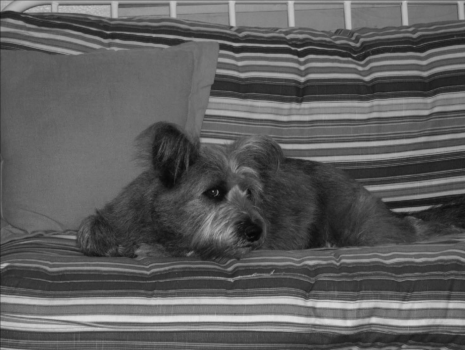
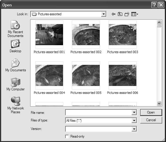
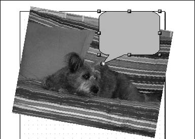
Terri the Guard Dog is shown here taking a break from work. It's a passable picture, but for publication you would need to make it smaller and cut out most of the background. You open the photo the same way you open any other le with OOo--by selecting File > Open and highlighting the desired le.
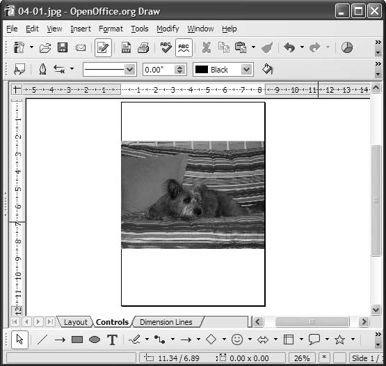
You'll see that the photo opens as part of a slide or text page, not on its own.
OOo displays pictures as part of something else, not all by themselves. To isolate the image so that you can work with it, click it so that it grows little "handles" at its edges.
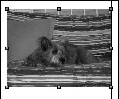
As long as you see those handles, you are working only on the material inside them. In this case, you will make the photo smaller so that it takes up less space on the printed page.
There are several ways you can do this. The most obvious is to put the cursor on one of the corner handles and move it toward the opposite corner while holding down the left mouse button. The only problem with this method is that it can distort the photo if you aren't careful.
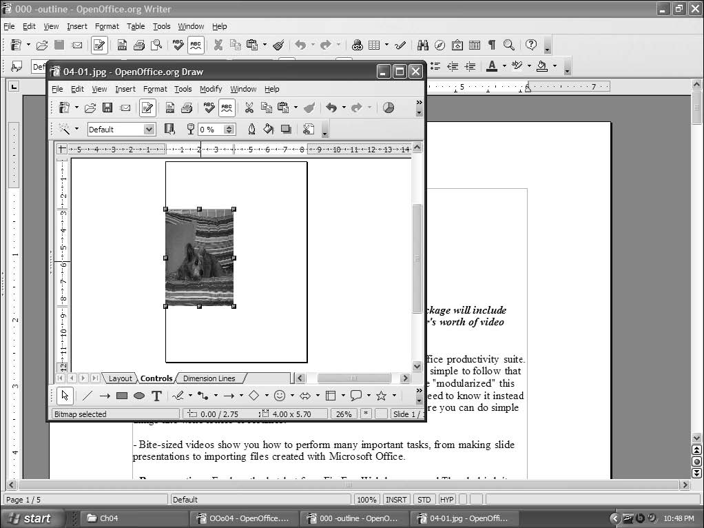
This can be a fun "effect" if you do it on purpose, but this time you'll press Ctrl-Z or select Edit > Undo to take you back to where you were. Now you'll resize the photo correctly by right-clicking it and choosing Position and Size (the third menu choice from the top). You see the Position and Size dialog box.
We can do a number of things in this dialog box, but rst you'll make the photo smaller. You can decide what size you want, in inches or pixels. If you check the Keep Ratio box, the program automatically keeps the photo the right shape if you change either its horizontal or vertical dimension.
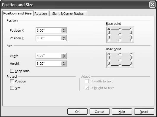
You can also ip or rotate photos with OOo Draw. There are several ways to do this. One is to use the Rotation tab in the Position and Size dialog box. Either click one of the preset sideways, upside-down, or 45-degree angle choices, or use the little window to the left of the "big" choices there to select your rotation angle in 15-degree increments. If that isn't enough choices, you can go to the menu at the top of the OOo window, choose Modify > Rotate, and use the corner handles on the picture to turn it. You can try various angles until you nd one you like.
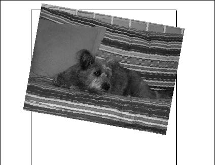
You may think this looks silly. No problem; you can undo the change by pressing Ctrl-Z or by selecting Edit > Undo. You can place your dog at any angle you want.
Making (or Altering) Pictures with OOo Draw Drawing Tools
To create your own art, start with a blank drawing slate, which you get by selecting File > New. Then choose Drawing from the "What kind of new work?" choices that show up to the right of the main menu when the cursor is over (or to the right of) the word New. This gives you tools along the bottom of the work area in addition to the ones along the top that you got when you opened a Text Document window.
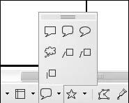
You see a number of icons, starting with a pointer at the left. Each drawing icon has a little down-pointing arrow next to it. Click the arrow next to the Callout icon--the one that looks like a cartoon speech balloon. You see a menu that gives you several different "cartoon balloon" styles.
Select a callout--or any other drawing shape tool--by clicking it. Then choose a point in your picture where you want to insert it, and click and hold down the left mouse button while you move the mouse diagonally until the shape is the size you want it.
Don't worry if you don't get the size or alignment exactly right or if you want to rotate your newly-added bit of art in one direction or the other. You can use the same Size and Rotation tools you used on Terri's picture. You can move it around by clicking it and moving the little cross that this action turns the cursor into. You can even change the shape of your shape with the little handles on the edge of the graphics square that contains it.
The rest of the shape icons work exactly the same as the callout one. You can move the mouse over each one and read the little text box that pops up. It will take you only a few seconds to try each one and see what it does. Mistakes are ne. If you don't save your work after you practice, no one will know you made them. So please experiment freely. All pixels (the little dots that make up pictures on the screen) created with OOo Draw are fully recyclable; no precious resources or landll space are used by your self-training sessions.
Adding Text to Drawings
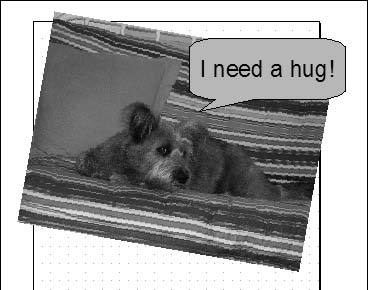
The Text Draw icon needs additional explanation but is useful enough for nongraphics people to make its way into this chapter instead of being reserved for Chapter 7, which goes into advanced Draw tricks. To use this icon, click it, and then drag the little cross that the cursor becomes to where you want to type your text.
Type it in, alter the font and text size exactly the same way as when you're creating a text document, and you have text.
This example changes the callout size and shape to t around the text.
Saving Image Files
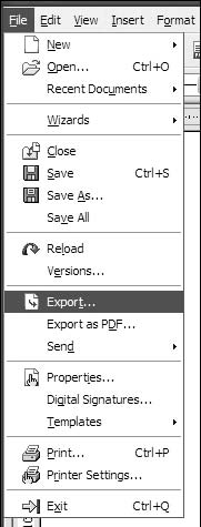
This is where things get a little tricky. Remember when I said that OOo treats images as part of a page or presentation? That's how it likes to save them, too. If you select File > Save As while you're working with an image le, you'll end up with a le type that works only with OpenOfce.org, not an image le that can be opened by all kinds of picture-editing software. So, being a bit tricky yourself, if you plan to use an image le in anything other than an OOo document or presentation, you export it to the le format you want. Instead of choosing Save As when you want to save your graphics le all by itself instead of as part of something else, select File > Export. This brings up the Export dialog box and a list of graphics le format choices.
If you're an experienced artist or Web designer, you'll see most of your favorites here--even Macromedia Flash. If you don't know one graphics le format from another, the safest choice is JPEG. This is the format used by most digital cameras. Virtually all known graphics programs and Web browsers, for all operating systems, can read JPEG pictures.

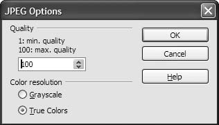
You need to select only two more options if you decide to save your image in JPEG format: Quality and Color Resolution. The default quality is 75%, which is good enough for Web publishing, but unless you're sure this is all you'll do with this graphic, it's probably better to choose 100%. You can always lower the quality later, but after you've lowered the quality, you cannot raise it.
In the Grayscale versus True Colors choice, it's better to choose True Colors for much the same reason: You can always turn a color image into a black-and-white one later, but you can't add color into an image you've saved in black and white.
All you need to do now is pick a name for your le, decide which directory and folder are the best place to put it, and click Save. Your picture is now ready to liven up your next text document, slide presentation, spreadsheet, or Web page.


Re:Excerpt?! (Score:1, Offtopic)
Re:Excerpt?! (Score:2, Funny)
A combination of the "Control" key, and the "Z" key undoes actions?! Where can I send my money to?
All this time I've been shaking my computer like an etch-a-sketch. I mean, the screen always went black like a person would expect it to. But this . . . this . . . wowie wow wow, wow-wow-wow. This will be much easier on my wrists. Alas, much to
Buy it? (Score:3, Interesting)
That's not the Open Source way!
Make a downloadable PDF and a PayPal donation page. After all, the people who did all the work actually writing OOo are giving it away.
Re:Buy it? (Score:1)
You misspelled "LaTEX."
Re:Buy it? (Score:2)
Don't you mean LaTeX?
Re:Buy it? (Score:2, Interesting)
The "e" in "TeX" should be descended, so that its lateral mid-point is located at the basline for the other glyphs. This was a "Gosh, Wow" for Knuth - a visual pun, and a demonstration of capability. Earlier computer text and type processors were incapable of even correctly rendering the name of his successor.
Without the application
Re:Buy it? (Score:5, Insightful)
Re:Buy it? (Score:4, Insightful)
Here's what I propose:
OOo puts together a CD containing a Windows build, a couple of popular Linux builds (including Darwin, if they have it), the source code, and a million and one references to visit the website. Then they slap a pretty label on the CD, package it in a bright colorful box extolling the virtues of the program and how it can do everything Microsoft Office can do including open Microsoft documents, include a quickstart manual with links to the website for more information, toss it onto the software shelf next to all the other Office Productivity software, and charge $5 for it. That would pay for the CD printing and packaging costs. Perhaps Best Buy marks it up to $10 or $15. But how many newbie people, when buying a computer at Best Buy, will see OpenOffice on the shelf and say, "$15?! That's way better than the $200 Microsoft is charging! And look! It can do things that cost extra with Microsoft!"
Sure it's not beer free to the end user, but sometimes costs are incurred. I see this as a gain all around. Best Buy sells lots of these things, the customer gets warm fuzzies because they saved $185, the whole world starts to step out of the Microsoft cave and blink in the light, and OpenOffice gets to keep their souls.
Re:Buy it? (Score:2)
Maybe you should be discussing your ideas with these guys;
http://www.sun.com/software/star/staroffice/index . jsp [sun.com]
Re:Buy it? (Score:1)
Cost is assumed to imply qualit
Re:Buy it? (Score:1)
Do you want people to lose money that bad?
Re:Buy it? (Score:2)
1. Authors don't need to eat anymore
2. The people that need a tutorial for writing "I need a hug" on a picture of a dog already know how to search for tutorials on the web instead of finding books on their local Borders.
Re:Buy it? (Score:1)
ooo.... (Score:2)
Re:ooo.... (Score:1)
Daaaamn... (Score:3, Insightful)
I'm not talking about content, just quality - the "Note" ovals are shockingly bad-looking. Maybe it's just a poor export or conversion.
Re:Daaaamn... (Score:2)
Re:Daaaamn... (Score:3, Insightful)
It's best to shrink it yourself first with decent image editing software than let the web browser handle it. That way you don't give up presentation control, and the image is smaller to download in the first place.
I suspect you already kne
Re:Daaaamn... (Score:1)
Why using OOo for Windows XP (Score:2, Offtopic)
indeed (Score:1)
Re:indeed (Score:1, Troll)
Re:Why using OOo for Windows XP (Score:3, Insightful)
Re:Why using OOo for Windows XP (Score:2)
Especially since, for some reason, the book's title page shows a penguin [roblimo.com]...
Fits the subject matter (Score:2)
While I liked Point and Click Linux for the fun of it, I couldn't imagine giving it to friends who really wanted to learn the OS. I think Point and Click OOo will be something I can buy as a gift.
Suggestion: resize the article's contents (Score:2)
Picture Quality (Score:5, Informative)
Re:Picture Quality (Score:1)
That helps but the typos make for a painful read;
I assume this is the result of translation from the original to HTML.Not to be overly negative, this does look to be a good howto, but as a first impression I do have to question the quality.
Re:Picture Quality (Score:2)
The error you pointed out would be due to straight copy-and-paste from whatever format the book was in. Using proper typography, the word "file" would be written with a "fi" ligature (U+FB01) which didn't survive the copy-and-paste process.
By the way, would anything speak against allowing Ӓ-type entities in comments?
Re:Picture Quality (Score:2)
I read somewhere that there's a program that lets you do stuff like that... Can't think of the name right now, though.
Re:Picture Quality (Score:2)
Re:Picture Quality (Score:2)
Well, certainly not IE. I don't know about any others. Firefox is moving to Cairo for graphics rendering which will allow better image scaling, amoung other things.
http://pavlov.net/blog/archives/2005/08/more_new_
Re:Picture Quality (Score:1)
Re:Picture Quality (Score:2)
Re:Picture Quality (Score:1)
Re:Picture Quality (Score:2)
The other probably being sites that require 'www' [no-www.org].
Re:Picture Quality (Score:2)
There are several ways you can do this. The most obvious is to put the cursor on one of the corner handles and move it toward the opposite corner while holding down the left mouse button. The only problem with this method is that it can distort the photo if you aren't careful.
This can be a fun "effect" if you do it on purpose, but this time you'll press Ctrl-Z or select Edit > Undo to take you back to where you were. Now you'll resize the photo correctly by right-cli
Re:Picture Quality (Score:1)
Damn, and here I thought they looked bad because they were grabbed from an XP machine...
Live and learn, I suppose. Live and learn...
ironic? (Score:1, Redundant)
But then, I am a bit jaded.
Argh! My poor, SPaG Nazi eyes! (Score:4, Funny)
Re:Argh! My poor, SPaG Nazi eyes! (Score:1, Informative)
Re:Argh! My poor, SPaG Nazi eyes! (Score:3, Funny)
That's not the open-source way.
If you think it's rediculous, go jump in a lake. That's the open-source way.
(For the sig-impaired: the speeling si intenshonal.)
Uh-oh (Score:2, Insightful)
fi?? (Score:3, Insightful)
Re:fi?? (Score:2)
Re:fi?? (Score:3, Informative)
See Wikipedia for examples: Ligature (typography) [wikipedia.org]
Re:fi?? (Score:2)
Re:fi?? (Score:2)
Re:the new publishing = no editing, print on deman (Score:2)
Blockquoth the AC:
Given that looking through the first few IT books I find random things with random titles, where the comments describe the contents as the words "f***ing w**kers" or something similar, I'm guessing that lulu.com isn't the best ambassador for self-publish
Re:fi?? (Score:1, Informative)
It's just a hunch, but I am guessing that the ligature features of the font used in publication didn't make it into the HTML version.
Re:fi?? (Score:3, Informative)
Nathan
Re:fi?? (Score:2)
Hmm, I think i'll go with your explanation.
Jedidiah.
what's up with the missing "fi" everywhere? (Score:2)
.,$s/fi//g (Score:1)
Re:.,$s/fi//g (Score:2)
Just one possible explanation.
Re:.,$s/fi//g (Score:1)
"fi" ligatures (Score:2)
Just a guess, but based on experience.
Mantra (Score:2)
Repeat after me:
Anti-aliased fonts are harder to read.
Then repeat this:
Rasterize fonts before resizing images.
Re:Mantra (Score:1)
Features (Score:4, Insightful)
Re:Features (Score:1)
"OOo Draw is a simple program, not really suited for professional graphics people. But it's good enough for at least 90%"
That is just plain *WRONG* and written by (apparently) someone that has no idea what you can really do with OO Draw. OO Draw can do most everything that you can do in CorelDraw, it is a very powerful vector editing system, not just a way to insert photos and add stupid callout
Re:Features (Score:1)
Way to go, OOo (Score:2)
I guess they threw in the towel on copying Clippy... :)
Dog (Score:1)
Nah seems like a great gift along with an installation of OOo for my mother, personally I don't need a book for figuring out an office suite. But then again sometimes excel doesn't make sense (which I am being forced to use for almost everything at work.. either VBA or an arcane mainframe language known as Mark IV).
rst things rst (Score:2)
mozilla components included with OOo? (Score:1)
Start using Firefox--the safest, most secure Web browser available for Windows!
Filter out junk mail with Thunderbird and say goodbye to Outlook Express.
why does he cover that in this book?
Re:mozilla components included with OOo? (Score:1)
At least these are documented.
A couple of spelling mistakes (Score:2)
Re:A couple of spelling mistakes (Score:2)
You can also ip or rotate photos with OOo Draw. There are several ways to do this. One is to use the Rotation tab in the Position and Size dialog box. Either click one of the preset sideways, upside-down, or 45-degree angle choices, or use the little window to the left of the "big" choices there to select your rotation angle in 15-degree increments. If that isn't enough choices, you can go to the menu at the top
Re:A couple of spelling mistakes (Score:2)
Some misappropriated non commercialist rant here (Score:2)
It is perfect fine for them to post their own shit! it is their site
quick someone post a hacked torrent link with all the text in rot13 for us in the one thousand three hundred and thirty seven club.
"And behold, a multitude of geeks shall enter Borders (OMG TM R LOL) and shal
Re:Some misappropriated non commercialist rant her (Score:2)
Dept (Score:1, Offtopic)
I wonder... (Score:2)
I'm sorry, but this is SO far behind Office 12 (Score:1, Troll)
Title (Score:2)
"ooOOOoooooo, draw documents with imagination. Ooooooo! Ahhhhhhh."
OO Draw RCs.. (Score:1)